(Problem → Role → Results)

Redesigned BoardSpace's top-used tools:

Agenda builder

Meetings dashboard

And minute recorder.

The outcome:

A cleaner, faster experience now in production

Reducing complexity

And aligned with the refreshed design system.

They said:

“The agenda builder was rigid,

The minute recorder convoluted

and the layout confusing.”

BoardSpace:

Too complex for users to use Agenda builder

Many core features were built from a developer perspective

and cluttered user screens,

Leading to overwhelming experiences.

We analyzed user research to identify pain points

BoardSpace had existing

User research data focused

on common user challenges.

We reviewed testing material to diagnose

Where users felt most

Stressed in the platform.

Excess screens to complete identify key pain point

Excess screens

to complete identify

key pain points

Rigid agenda builder

Excess screens

to complete

a task

Here’re some of the techniques we used to really understand frustrations and opportunities

Want a more in-depth look at our research, insights, and process? Read more Down Here↓

We worked as a design team on a real usability challenge for BoardSpace, a B2B web tool used by nonprofit boards.

BoardSpace helps board members run smoother meetings with tools for agendas, documents, and minutes.

But the old system was cluttered, hard to use, and time-consuming.

This case study shows how we improved the experience— from research and design to the end

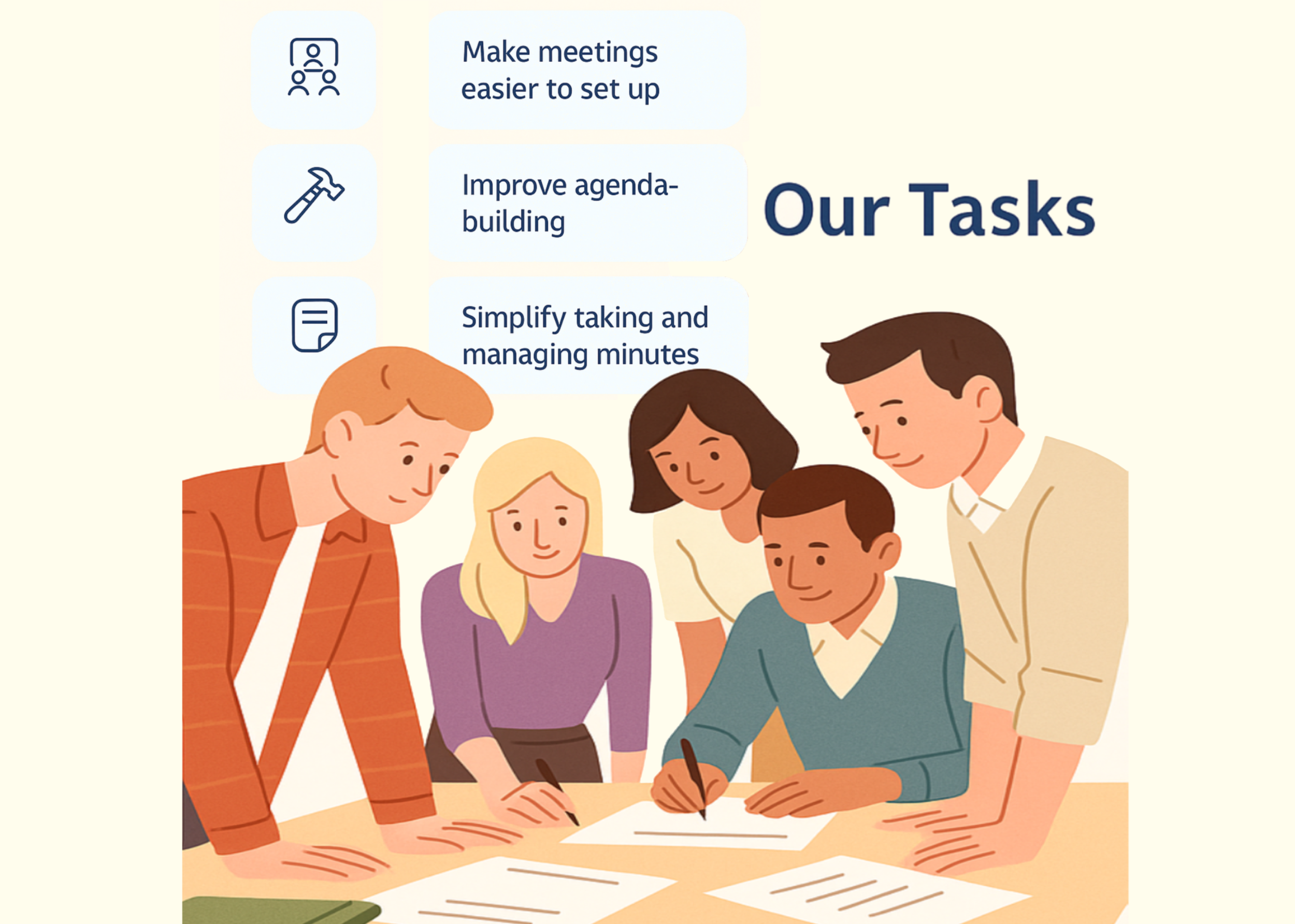
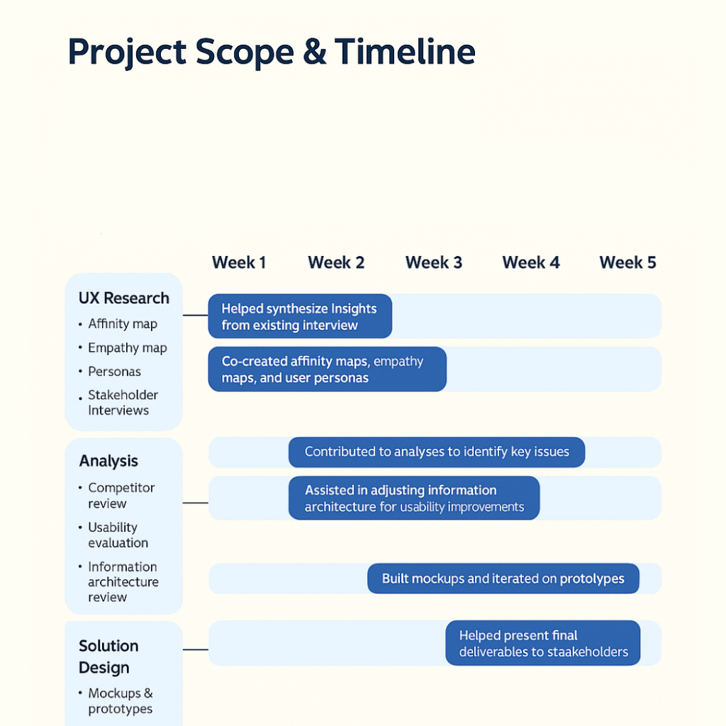
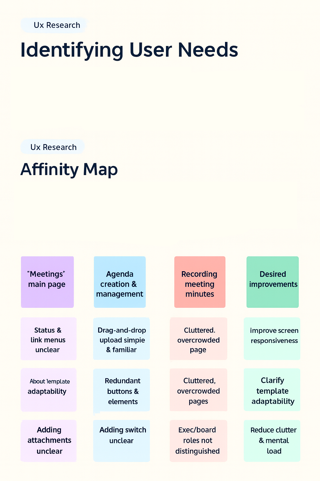
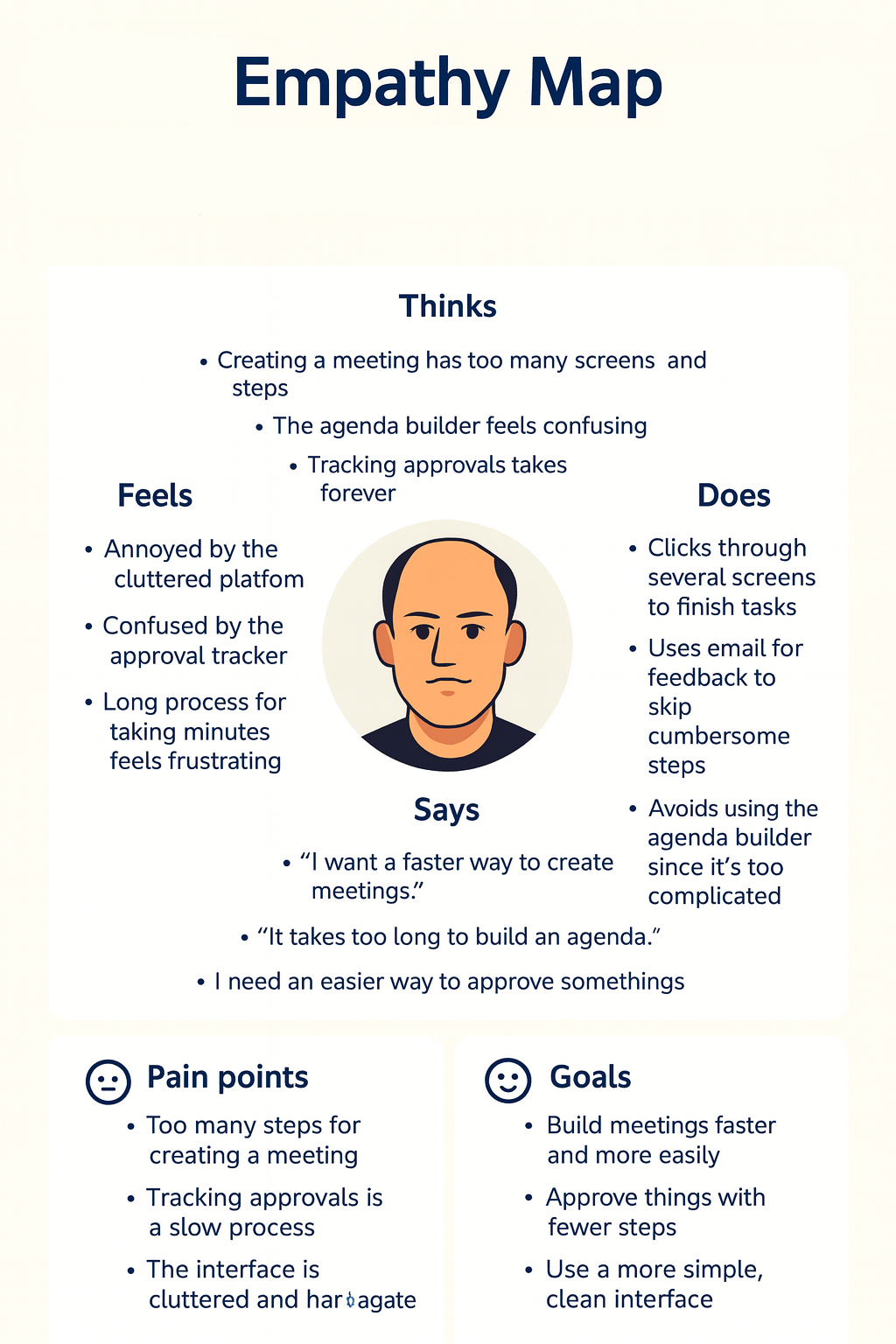
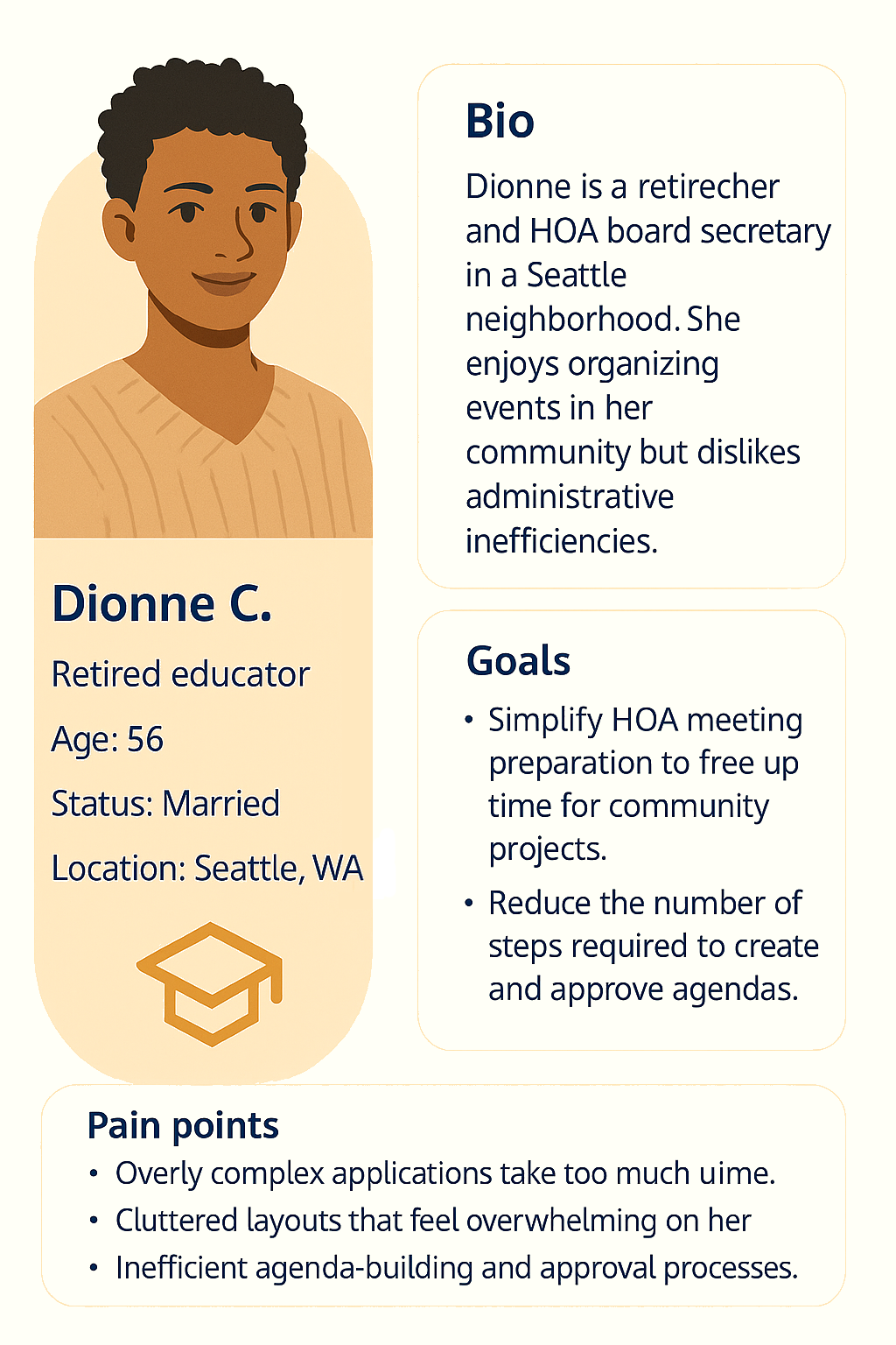
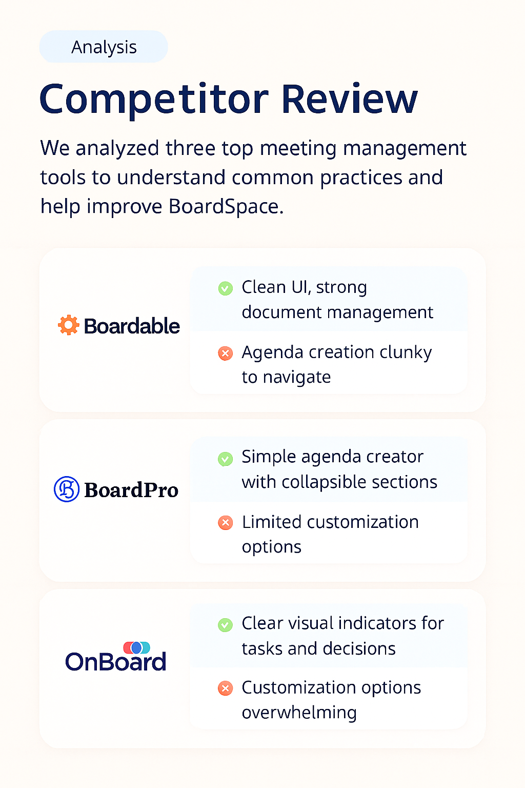
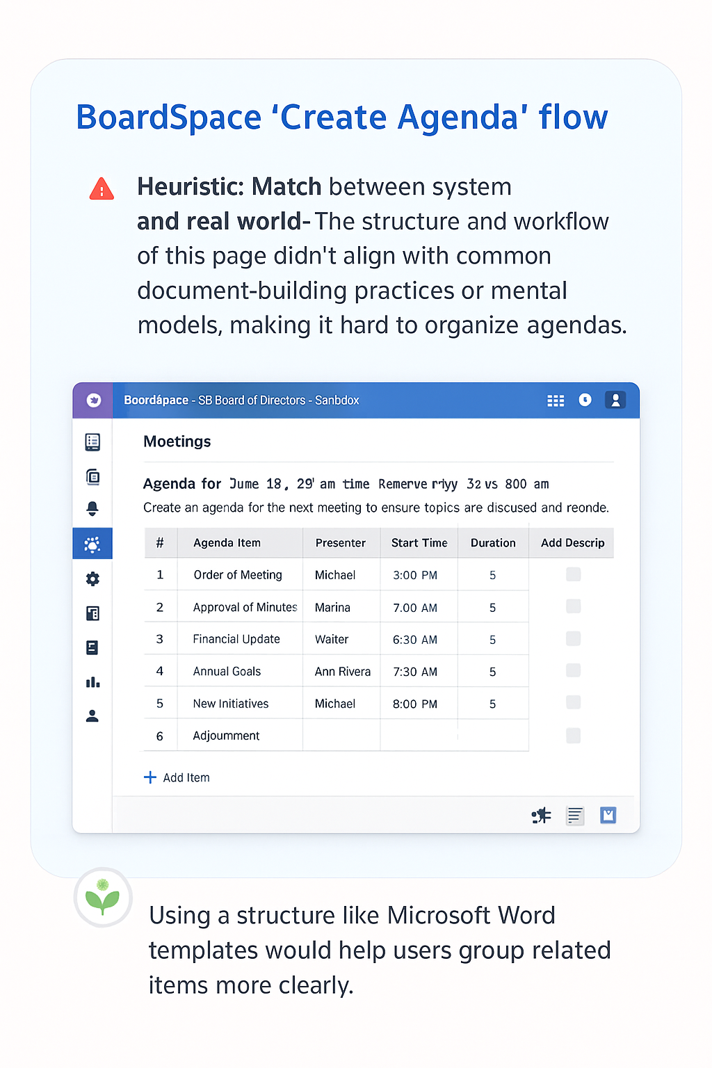
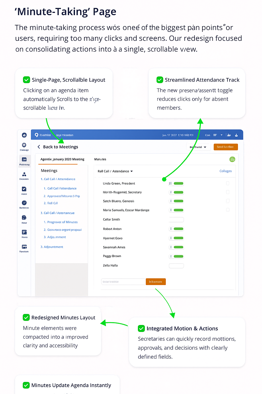
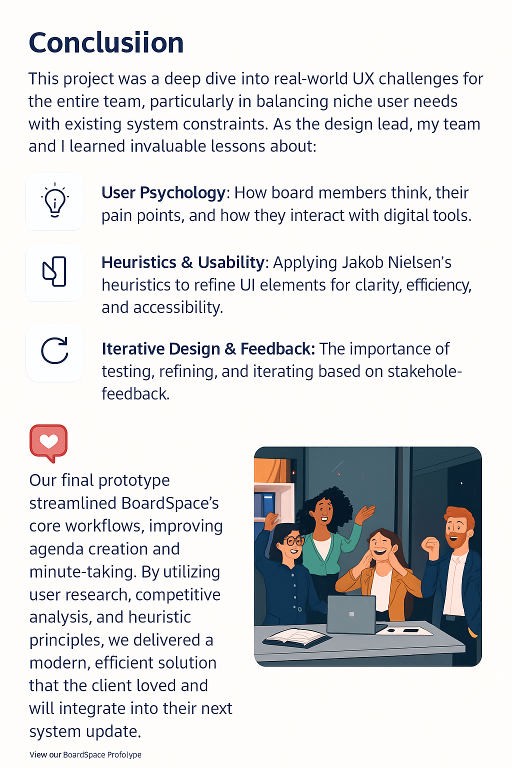
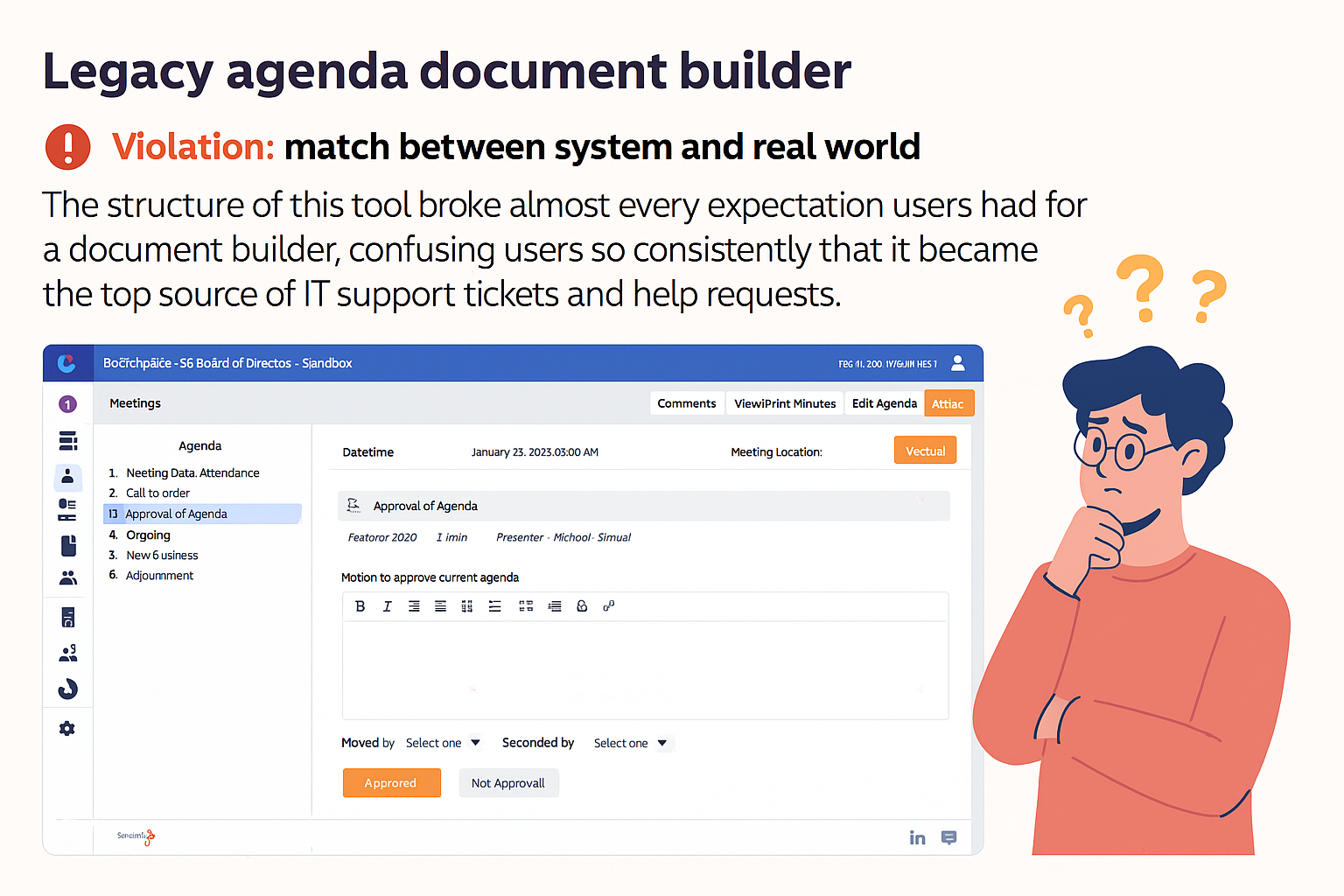
As a design team member, I contributed across researcch, analysis, and solution design, I partnered with the design lead and CEO Pat to align decisions, took ownership of assigned tasks, built key areas of the prototype, and supported the final presentation

Before designing, we analyzed past user research, including board member interview transcripts, to identify key user pain points. We synthesized insights using affinity mapping, empathy mapping, and user personas.

We mapped out user frustrations and common themes. Users struggled with an overwhelming, cluttered interface that included too many steps, a confusing agenda builder, and inefficient minute-taking.

We created an empathy map to see how users felt about the platform.

Here!!

See the prototype & interact with it

Next
Next

Bestrip